One of the most exciting and vexing and challenging and time-consuming parts of making a book is coming up with the cover, because no matter how many times we’re cautioned not to judge a book by it, the cover is that first impression we can never shake. And so a whole lot of people work very hard to make sure it is a good one.
The process usually begins with our art director Natalie saying to Robbi, “Take a stab at some cover ideas,” which always makes Robbi feel wiggly because as much as she muddles her way through our various in-house design needs, she is NOT a designer and does not play one on television. Nevertheless, Robbi dutifully creates a few thumbnails and sends them along.

To which Natalie responds something along the lines of. “Great! Let’s see that one with the big owl in a little more detail and maybe also that one with the three kids and the owl, but maybe with a little more excitement happening above the title.”
Robbi is extremely excited at this point, because the one with the big owl is her favorite.
And so she draws and draws and sends two sketches to Natalie.
One with a little more detail. 
One with a little more excitement.

At this point, Natalie and Erin take the more fully developed sketches to the team of people at Macmillan whose specialty is covers. They have important conversations to which we are not invited so as to protect our tender feelings from the grim realities of the rough and tumble world of selling books.
After the meeting, Natalie writes and says something along the lines of, “That excitement you added above the title was great, but how about having Moxie as a central figure, with the other characters sort of surrounding her like a frame. And be sure to put Milton in there somewhere, too.”
To which Robbi responds with this.

To which Natalie responds, “Thanks! I’ll share this with the Mysterious Cover Committee, but in the mean time, please see what Moxie and Milton would look like in color.”
Which makes sense, because of course the cover will be in full color but to this point, Moxie and Milton have been living in a black and white world.
So Robbi does this, and we all go ooh! and ahh! Because who doesn’t like color?

To which Natalie says, “Great on the color, but as you revise the sketch, keep Moxie in the middle, get Milton out from under her foot (that’s just mean!), keep the upper excitement, create a band of human characters in the middle and another band of non-human characters along the bottom. And separate the bands with color breaks. Sound good?!”
To which Robbi responds by tearing out just a few of her hairs before turning back to proverbial (and literal) drawing board coming up with the following.

We loved how Milton was on a stepladder (accentuating his trademark shortness), and how he is actively involved with adjusting the “s” in “McCoys,” (accentuating his trademark fastidiousness and also introducing the reader to the interaction of image and language that is to be found throughout the book).
Robbi and I were very excited about this cover. We thought it was perfect. We sent it to Natalie.
To which Natalie replies, “YOU ARE ON THE RIGHT TRACK, but let’s make the colors less depressing and get rid of that extremely creepy bug in the lower left and make your names a bit bigger, forgodsake.”
Because Natalie has powers, she turned the basic elements of Robbi’s sketch into the following.

Natalie also sent us the drawing below, which shows how the bands of color might extend onto the back. Robbi was pleased to see the return of the big owl, which, if you don’t remember, Robbi really liked.

At this point, Natalie and Erin took the cover to the Top Secret Committee of Monumental Cover Design Decision Making, and reported back that, “No, no, no. This is all wrong.”
At which point, Natalie changed into her ninja outfit and chopped down an entire bamboo thicket with one hand while using the other hand to blow up the previous cover concept and coming up with this entirely new one.

To which we said, “Oh yes. This is JUST RIGHT. We love it. You must be an actual designer who also plays one on television.”
To which Natalie responds by sending us a bunch of enthusiastic-yet-inscrutable emojis which make us laugh. It is her way. We love her for it.
In the weeks that follow, we make a bunch of minor adjustments to the above sketch, adding this and subtracting that, improving the color and adding a band with our names at the bottom.
Eventually, the real live book arrives in the mail and we cry a little (me) and swoon a little (Robbi). It’s so beautiful we can barely stand it. The fact that our names are on the cover of this beautiful book hardly makes sense. But there they are.
Matthew Swanson & Robbi Behr

We turn it over and have a look at the back.
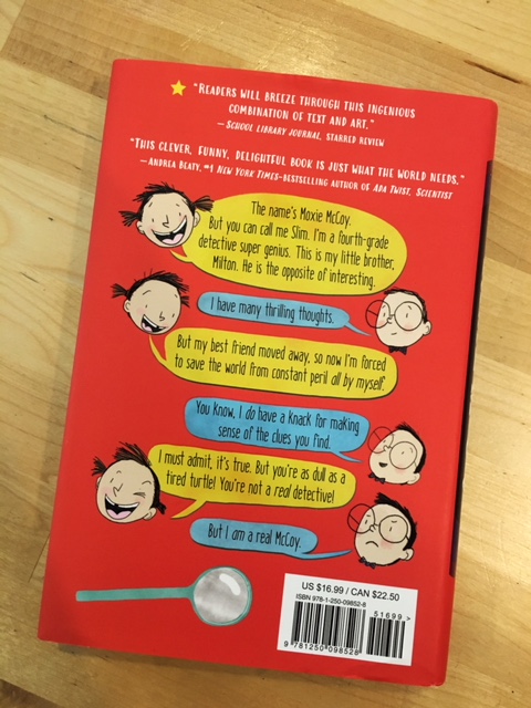
Maybe Robbi didn’t get her big owl, but we LOVE how the back turned out. It’s a little taste of Moxie and Milton, how they talk, how they relate, the funny faces they make.
And, in full disclosure, Robbi did get a little owl. The nice thing about a dust jacket is that it sneaks around the corners of the covers so that the Committee of People Who Write Compelling Dustjacket Copy have a place to put their carefully crafted words.

And, to be utterly comprehensive, here is the back flap, where the Person Who Describes the Salient Facts of Author and Illustrator Lives (that would be I) gets to have his say.

We love every inch of every panel of these covers. We love the design. We love the colors. We love the texture. We love the kind testimonials from people who know what they are talking about.
We just plain love this book. And hope that you will, too.